When creating a website with SiteBlocks, we make sure that your content is already responsive and dynamic so that your viewers can access your pages on a variety of device types with ease. If you would like to preview how your website looks on different devices, you can use the Viewer.
Where to Find
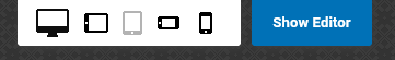
To enter responsive viewing, click the “VIEWER” on the main left toolbar. The top right buttons allow you to preview pages in different device modes.

If you would like to exit the responsive Viewer, simply click the blue “Show Editor” button to return to editing your website.
Different Screen Sizes
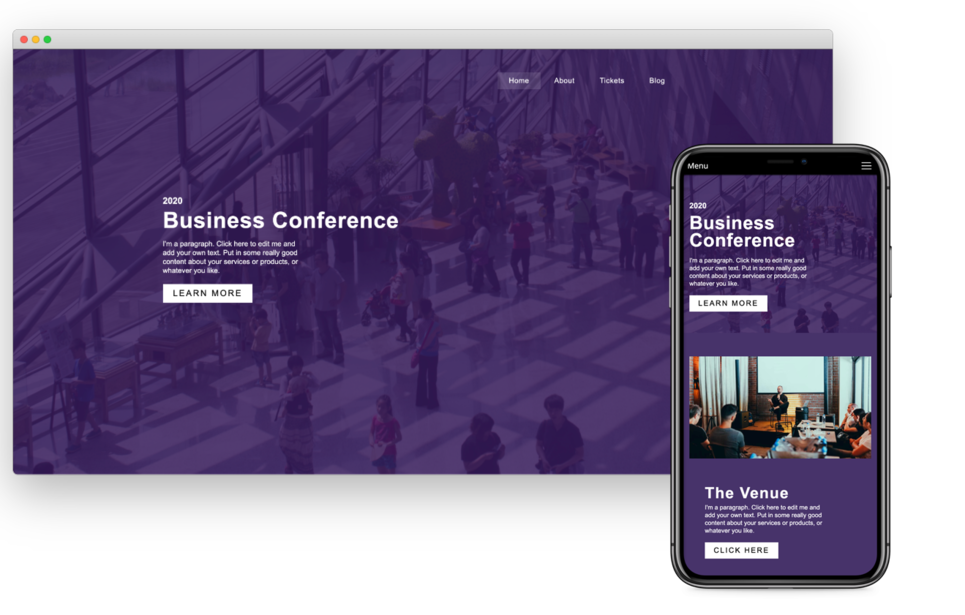
A responsive website (such as your SiteBlocks website) will intelligently adjust the your website content and layouts based on your device type, screen size and orientation. For example, when viewing a website using your smartphone, you may have noticed in the past that the website looks different on your small device with larger menus and the content adjusted to the size of your screen. If you visited that same website on your home computer, the layout may appear differently if the website was responsive.
Previewing your website using the Responsive Viewing mode can give you an insight on how your website will appear on a different device without having to actually access your website on a different device.
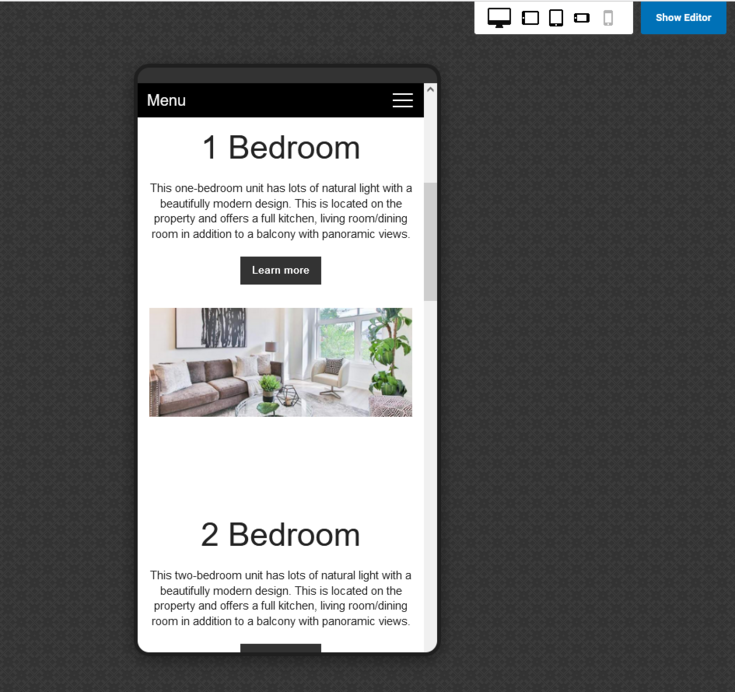
The responsive viewer will allow you to view your website from the following device options:
- Desktop Mode
- Portrait Tablet Mode
- Landscape Tablet Mode
- Portrait Smartphone Mode
- Landscape Smartphone Mode
Editing Content for Responsive Screens
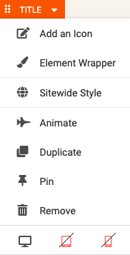
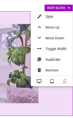
You can choose which elements will appear on certain device types. By default, SiteBlocks ensures your content is already dynamic and responsive, allowing your elements to appear on computers, tablets, and smartphones. If you would like to disable an element on a certain device type, this can be achieved by simply clicking the device type in the Element Toolbar. Simply hover your mouse over the element to access the Element Toolbar, from here you can enable/disable viewing on a computer, tablet, or smartphone by clicking on the corresponding icon located at the bottom.
Create "Mobile Only" and "Desktop Only" Versions of your Elements and Blocks
If you would like certain content to only appear on mobile devices or desktops, you can do so by controlling their visibility by disabling the element on specific device types.
To create mobile-only content, simply disable the content on other devices by clicking the monitor icon and/or tablet icon.
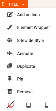
Then, you can create a desktop-only version of that content directly above or below the mobile-only block or element. Simply disable the desktop-only content on smartphones and tablets.