Menu

Welcome to the SiteBlocks Site Builder

HELP CENTER

Blog posts : "Elements"

World Map Element

The World Map Element allows you to create a map with custom markers. For each marker, you can add text on hover and click. This is a great element for sharing locations, hours, details etc. for your business location(s).


Customize your Map


To get started, go to the "Settings" option listed in the Element Toolbar. 

To add a new pin, simply click the location on the map you would like to add the pin, this will create a pop-up window that will prompt you to fill in a title and description. Click Save to confirm.

To delete or edit a pin, click on an existing pin in the map. From here you can edit the title and description (you must click Save to confirm). If you would like to delete the pin, click the Delete button in the bottom left corner of the pop-up.


To style your map, you can adjust the map background (this is the watercolor), marker, or marker border (this is the outline around the marker). Simply click on the color tiles located in the right column of the World Map settings to adjust the color using a color picker.


To remove all pins, click the clear markers button on the bottom right side of the World Map settings.


Where to Find


This element can be found in the "ELEMENTS" section of the Toolbar.


Adding to Website


After selecting this Element, you will be able to choose exactly where you want to add it! Simply drag this onto a blue, orange, or purple ribbon that will appear when dragging the element onto the page.


Options


For more options for your World Map Element, you can visit the following in the Element Toolbar:


Element Wrapper: Add some style to your element! Customize the font, and background, create a border, and adjust the space around the element by changing the margin and padding values.


Animate: You can add an animation for your Element. This will appear when the visitor first loads your page and the animation will display as your Element appears on the page.


Duplicate: To quickly add another Element, select the "Duplicate" option in the Element's toolbar.


Pin: You can optionally "Pin" the World Map to multiple pages to add consistency to the style of your website. 


Go Back

Video Player Element

The Video Player Element is an HTML5-style video player that supports computers, smartphones, and tablets. It works in all modern browsers that support the video tag. Upload any MP4, WEBM, or OGG formatted videos.


To upload your video go to "Settings" in the Element Toolbar and click "Select a Video File" to browse your files in the Photos and Media manager.


Where to Find


This element can be found in the "ELEMENTS" section of the Toolbar.


Adding to Website


After selecting this Element, you will be able to choose exactly where you want to add it! Simply drag this onto a blue, orange, or purple ribbon that will appear when dragging the Element onto the page.


Options


For more options for your Element, you can visit the following in the Element Toolbar:


Settings: Upload your video from your Photos and Media Manager by clicking the "Select a Video File" button. You can optionally set a Title that will display on the top left of your video by entering it into the Caption Text field. Adjust the Maximum width (this will shrink with the size of the device) and height by using the sliders. If you would like to play to video automatically when the visitor opens the page you can check the "Autoplay on Page Load" checkbox.


Element Wrapper: Add some style to your element! Customize the font, background, create a border, and adjust the space around the element by changing the margin and padding values.


Animate: You can add an animation for your Element. This will appear when the visitor first loads your page and the animation will display as your Element appears on the page.


Duplicate: To quickly add another Element, select the "Duplicate" option in the Element's toolbar.


Pin: You can optionally "Pin" the Video Player to multiple pages to add consistency to the style of your website. 


Go Back

Flickr

We support the ability to add your Flickr images to your page through the Image Element, or you can display your Flickr album in a gallery with the use of our Flickr element. For more information on our Flickr element, please see an overview below.


You can upload images from Flickr, all you need to know is the username of your account. To begin, click "Settings" in the Element Toolbar. Type in the username of the Flickr account then select the folder location of the images you would like to display. Click the "Select Image" hotlink below the image of your choice.


Where to Find


This element can be found in the "ELEMENTS" section of the Toolbar.


Adding to Website


After selecting this Element, you will be able to choose exactly where you want to add it! Simply drag this onto a blue, orange, or purple ribbon that will appear when dragging the Element onto the page.


Options


For more options for your Element, you can visit the following in the Element Toolbar:


Settings

Select Images Tab - Add your images by clicking the "Change Image" buttons. From here, you can upload images from your uploaded images, the stock photo library, or your computer.


Gallery Settings Tab - Click "Save Changes" to confirm. Change the layout of your images by selecting from the layout tiles or by manually adjusting the image dimensions using the sliders. Add a border by increasing the width.


Viewer Settings Tab - By default clicking an image will bring up an image carousel to view the images in a slideshow style. You can turn the image slideshow off or alternatively open the image file in the window from the "Clicking an Image Will..." dropdown menu.
You can also enable/disable image titles, image descriptions, download buttons, and a thumbnail carousel with the Display Options checkbox fields.


Element Wrapper: Add some style to your element! Customize the font, background, create a border, and adjust the space around the element by changing the margin and padding values.


Animate: You can add an animation for your Element. This will appear when the visitor first loads your page and the animation will display as your Element appears on the page.


Duplicate: To quickly add another Element, select the "Duplicate" option in the Element's toolbar.


Pin: You can optionally "Pin" the Flickr element to multiple pages to add consistency to the style of your website. 


Go Back

YouTube Element

Use this element to insert a YouTube video into your website content.


Adding a YouTube Video


To quickly update the video link, simply double-click on the video to paste it into a new YouTube video link.


You can also obtain the embed code from YouTube and update the video manually. Simply navigate to the YouTube video you would like to add. From here you can click "Share" and then "Embed". This will provide you with new code you can copy and paste into the window. 

Remember to click "Save Changes" once you are done.


Editing the Appearance of your YouTube Video


YouTube videos are embedded into this element using HTML. You can make further adjustments to height and width by editing the HTML embed code. To edit the embed code, click "Edit HTML".

Currently, we have the following video embed code as a placeholder:
 
<iframe allowfullscreen="" width="640" height="360" src="//www.youtube.com/embed/k0lQHHiRLS4?rel=0" frameborder="0"></iframe>

You can manually set the width and height to values of your choice.


Where to Find


This element can be found in the "ELEMENTS" section of the Toolbar under Media. Simply drag this onto a blue, orange, or purple ribbon that will appear when dragging the Element onto the page.


Adding to Website


After selecting this Element, you will be able to choose exactly where you want to add it! Simply drag this onto a blue, orange, or purple ribbon that will appear when dragging the element onto the page.


Options


For more options for your Blog Archive Element, you can visit the following in the Element Toolbar:

 
Edit HTML: Embed your Youtube video iframe code here. For more information see 'Adding a Youtube Video' above.


Revisions: A revision is created every time a save is made, the system keeps the last 10 revisions, these are your save points. When you select a revision your current content will be replaced by the revision. You can revert back by choosing the latest revision.


Element Wrapper: Add some style to your element! Customize the font, background, create a border, and adjust the space around the element by changing the margin and padding values.


Animate: You can add an animation for your Element. This will appear when the visitor first loads your page and the animation will display as your Element appears on the page.


Duplicate: To quickly add another Element, select the "Duplicate" option in the Element's toolbar.


Pin: You can optionally "Pin" the YouTube element to multiple pages to add consistency to the style of your website. 


Go Back

Before After Element

Display two images beside each other in a "Before and After" collage style with this Before and After Element.


Where to Find


This element can be found in the "ELEMENTS" section of the Toolbar.


Adding to Website


After selecting this Element, you will be able to choose exactly where you want to add it! Simply drag this onto a blue, orange, or purple ribbon that will appear when dragging the element onto the page.


Options


For more options for your Before After Element, you can visit the following in the Element Toolbar:

Settings:  Add your images by clicking the "Change Image" buttons. From here, you can upload images from your uploaded images, the stock photo library, or your computer. Click "Save Changes" to confirm.


Element Wrapper: Add some style to your element! Customize the font, and background, create a border, and adjust the space around the element by changing the margin and padding values.


Animate: You can add an animation for your Element. This will appear when the visitor first loads your page and the animation will display as your Element appears on the page.


Duplicate: To quickly add another Element, select the "Duplicate" option in the Element's toolbar.


Pin: You can optionally "Pin" the Before and After elements to multiple pages to add consistency to the style of your website. 


Go Back

Blog Archive Element

This Element allows you to provide links to your archive of posts by dates, tags or categories. Adding this Element to your page is a great way to organize previous posts for your visitors.


Tip: Style your blog archive links by selecting "DESIGN" > "Link Styles" in the main toolbar.


Where to Find


This element can be found in the "ELEMENTS" section of the Toolbar.


Adding to Website


After selecting this Element, you will be able to choose exactly where you want to add it! Simply drag this onto a blue, orange, or purple ribbon that will appear when dragging the element onto the page.


Options


For more options for your Blog Archive Element, you can visit the following in the Element Toolbar:

Settings:  Under the 'List By...' section, you can organize your archive by Months, Categories, or Tags from the drop-down menu. If you would like to include empty categories for consistency (displays all months, categories, or tags) check the "Include Empty Archive Links" checkbox. Limit the number of items shown using the next drop-down menu.


Element Wrapper: Add some style to your element! Customize the font, and background, create a border, and adjust the space around the element by changing the margin and padding values.


Animate: You can add an animation for your Element. This will appear when the visitor first loads your page and the animation will display as your Element appears on the page.


Duplicate: To quickly add another Element, select the "Duplicate" option in the Element's toolbar.


Pin: You can optionally "Pin" the Blog Archive element to multiple pages to add consistency to the style of your website. 


Go Back

Blog Posts Element

Add a Blog Post Element to display your blog. For complete information on getting started with Blog Posts and how to manage these using this Element, please see our wiki on Creating a New Blog.


Where to Find


This element can be found in the "ELEMENTS" section of the Toolbar.


Adding to Website


After selecting this element, you will be able to choose exactly where you want to add it! Simply drag this onto a blue, orange, or purple ribbon that will appear when dragging the Blog Post Element onto the page.


Options


For more options for your Blog Comments Element, you can visit the following in the Element Toolbar:

 
New Post: Create a new blog post. Please see the "Creating a new blog post" section of our wiki on Creating a New Blog.


Manage Blog: Manage posts, categories, and settings from here. Please see our wiki on Managing Blog Posts for a complete guide on this section.


Layout/Settings: If you would like to choose a preset layout, you can browse these and more by clicking the "Layout/Settings" menu option located on the top left of your Blog Posts element on your page. Preset Layouts are great for creating a blog post with appealing formats.


Element Wrapper: Add some style to your element! Customize the font, and background, create a border, and adjust the space around the element by changing the margin and padding values.


Animate: You can add an animation for your Element. This will appear when the visitor first loads your page and the animation will display as your Element appears on the page.


Duplicate: To quickly add another Element, select the "Duplicate" option in the Element's toolbar.


Pin: You can optionally "Pin" the Blog Posts element to multiple pages to add consistency to the style of your website. 


Go Back

Blog Comments Element

This element will show recent comments made on your blog posts. By default, this will display all recent blog comments.

For complete information on how to manage your Blog Comments, please see our Managing Blog Comments wiki.


Where to Find


This element can be found in the "ELEMENTS" section of the Toolbar.


Adding to Website


After selecting this element, you will be able to choose exactly where you want to add it! Simply drag this onto a blue, orange, or purple ribbon that will appear when dragging the element onto the page.


Options


For more options for your Blog Comments Element, you can visit the following in the Element Toolbar:

Settings: By default, your Blog Comments Element will auto-discover all recent posts, you can disable this by unchecking this box in the settings. You can also display all comments as inline by checking the corresponding checkbox on this page. Make sure to click Save Changes in order for these changes to reflect on your page.


Element Wrapper: Add some style to your element! Customize the font, and background, create a border, and adjust the space around the element by changing the margin and padding values.


Animate: You can add an animation for your Element. This will appear when the visitor first loads your page and the animation will display as your Element appears on the page.


Duplicate: To quickly add another Element, select the "Duplicate" option in the Element's toolbar.


Pin: You can optionally "Pin" the Blog Comments element to multiple pages to add consistency to the style of your website.


Go Back

Primary NavBar Element

Add a navigation bar to your website to help your visitors navigate your pages, files, blogs and any other content.

For complete information on how to create and customize a Primary NavBar Element, please see our wiki on the Navigation Bar.


Adding to Website


After selecting this element, you will be able to choose exactly where you want to add it! Simply drag this onto a blue, orange, or purple ribbon that will appear when dragging the element onto the page.


Options


Element Wrapper: Add some style to your element! Customize the font, and background, create a border, and adjust the space around the element by changing the margin and padding values.


Animate: You can add an animation for your Element. This will appear when the visitor first loads your page and the animation will display as your Element appears on the page.


Duplicate: To quickly add another Element, select the "Duplicate" option in the Element's toolbar.


Pin: You can optionally "Pin" the Blog Comments element to multiple pages to add consistency to the style of your website.


Go Back

Comments Element

Allow visitors the ability to leave you a message or log their visit on your website. This is a great way to add some interactivity for your visitors, and encourage discussions directly on your website. 


Where to Find


This element can be found in the "ELEMENTS" section of the Toolbar.


Adding to Website


After selecting this element, you will be able to choose exactly where you want to add it! Simply drag this onto a blue, orange, or purple ribbon that will appear when dragging the element onto the page.


Options


For more options for your Comments Element, you can visit the following in the Element Toolbar:

View Posts: You can manage all comments from the "View Posts" option in the Element Toolbar, which will bring you to Visitor's Messages for both your blog and visitor comments. For more information about managing your comments from the Visitor's Messages section, please see our wiki article on Managing Blog Comments.


Edit: Add a descriptive name to your Comment Element. The default value is the page name the Comments Element is on.  You may want to describe the section. (Example: Home Sidebar).


Element Wrapper: Add some style to your element! Customize the font, and background, create a border, and adjust the space around the element by changing the margin and padding values.


Animate: You can add an animation for your Element. This will appear when the visitor first loads your page and the animation will display as your Element appears on the page.


Duplicate: To quickly add another Element, select the "Duplicate" option in the Element's toolbar.


Pin: You can optionally "Pin" the Blog Comments element to multiple pages to add consistency to the style of your website.


Go Back

Button Element

Instead of having plain links on your website, add a custom button to your page to direct your visitors where you want.


Where to Find


This Element can be found in the "ELEMENT" section of the Toolbar.


Adding to Website


After selecting this Element, you will be able to choose exactly where you want to add it! Simply drag this onto a blue, orange, or purple ribbon that will appear when dragging the Element onto the page.


Changing the Appearance of your Button


You can change the appearance of your button by using the Button Editor. To access the Button Editor simply click the "Edit Button" option in the Element Toolbar.

Text / Position: Change the text displayed on the text and adjust its alignment on the page. You can also add an Icon to your button by clicking the "Add Icon" button to search our extensive icon library.


Switch Button: Select from a list of button styles to get started. Not quite what you are looking for? No problem! Pick the button style you like the most and then click the pencil icon to edit this button further. 


Linking your Button


You can link your button to many different locations. To get started, click "Edit Link" in the Element Toolbar to add/update the link for your button. From here, you can select from the following options:

Link to a Page: Select a pre-existing page from your website to add to your Button.

Link to a File: Add a file from your Photos and Media Manager.

Link to a Website: Paste in the complete URL of a website.

Link to an Email: Have your visitors create an email addressed to your email in their local email client to contact you.

Link to Blog Page: Create a page for your blog or type in the existing URL.


Go Back

Bravenet Tools Element

Add Bravenet tools to your website by using this element. You can obtain the embeddable JavaScript or HTML code when managing your Bravenet tool.

You can add your embed code by clicking on the "Edit" button in the Element Toolbar and pasting it into the text field.


Where to Find


This Element can be found in the "ELEMENT" section of the Toolbar.


Adding to Website


After selecting this Element, you will be able to choose exactly where you want to add it! Simply drag this onto a blue, orange, or purple ribbon that will appear when dragging the Bravenet Tool Element onto the page.


Editing 


Need to make a change? You can access the settings for this Element again by clicking on the "Edit" button on the Element Toolbar.                    


Go Back

Icon Element

Add an icon to your website to catch your visitor's attention. We encourage you to explore our large library of creative and fun icons, we may have just what you are looking for!


Where to Find


This Element can be found in the "ELEMENT" section of the Toolbar.


Adding to Website


After selecting this Element, you will be able to choose exactly where you want to add it! Simply drag the element to any blue, orange, or purple ribbons that will appear when dragging the Element onto your page.


Choosing your Icon


Access the Icon Editor by clicking "Edit" in the Element's Toolbar to search and browse from our large collection of icons.


Options


When a visitor clicks on your icon, you can add a link to another location through the "Link" option in the Element's Toolbar.

You can optionally "Pin" the icon to multiple pages to add consistency to the style of your website. Simply select the "Pin" option in your Element's toolbar

To quickly add another Icon Element, select the "Duplicate" option in the Element's toolbar.


Go Back

Line Element

A Line Element is a great way to style your website. Adding a line between content can sometimes help organize content and helps avoid having a crowded or busy-looking page. 


Where to Find


This Element can be found in the "ELEMENT" section of the Toolbar.


Adding to Website


After selecting this Element, you will be able to choose exactly where you want to add it! Simply drag the element to any blue, orange, or purple ribbons that will appear when dragging the Element onto your page.


Options


Access the Line Editor by clicking the "Style" option in the Element's Toolbar to customize your line by changing the styling and spacing of the element.

You can optionally "Pin" the spacer to multiple pages to add consistency to the style of your website. Simply select the "Pin" option in your Element's toolbar

To quickly add another Line Element, select the "Duplicate" option in the Element's toolbar.


Go Back

Link List Element

A Link List is used for adding navigation items in the form of lists of links. This Element works in the same way as the Primary NavBar element on the Toolbar with the ability to be added to any content section of your website.


Where to Find


This Element can be found in the "ELEMENTS" section of the Toolbar.


Adding to Website


After selecting this element, you will be able to choose exactly where you want to add it! You will see all available content locations it can be added to the current page only (content locations in orange, blue, or purple). 


Customizing your Link List 


You can add, delete, move, and rename the content for your Link List Element from the "Edit Menu Items" option in the Element Toolbar.


Link to a Page: Select a pre-existing page from your website to add to your Link List.

Link to a File: Add a file from your Photos and Media Manager.

Link to a Website: Paste in the complete URL of a different website.

Link to an Email: Have your visitors create an email addressed to your email in their local email client to contact you.

Link to Blog Page: Create a page for your blog or type in the existing URL.

Text only: Create a "non-clickable" text item. Great for labeling and organizing your Link List.


Arranging your Link List


Once you have created the items you would like to add to your link list, these will appear on the right side of the Navigation menu before saving. From here you can change the order of the items by dragging and dropping the items. To create a drop-down menu item, pull the item to the right when dragging it. You can remove this item from the drop-down by moving it to the left.


Go Back

Google Maps Element

This element allows you to add a Google Map to your website. If you have a business, this is a great tool to show customers where you're located!


Where to Find


This Element can be found in the "ELEMENTS" section of the Toolbar.


Adding to Website


After selecting this element, you will be able to choose exactly where you want to add it! You will see all available content locations it can be added to the current page only (content locations in orange or purple). 


Options


After choosing where this element will appear, you can configure it by going to the "Settings" located in the Element toolbar and then clicking the Location tab. You update the map location by entering an address and clicking on the "Find Address" button to set the location of the map. Click "Next" when the correct address has been located.


Further configurations can be done before the element is added under the Settings Tab.


Map Settings: Adjust the size of the map on your page by changing the height and width values (measured in pixels).


Small Screen Map Settings: Adjust the size of the map on your page for small screens by changing the height and width values (measured in pixels).


The Save Changes button must be clicked to confirm any changes.


Go Back

Contact Form Element

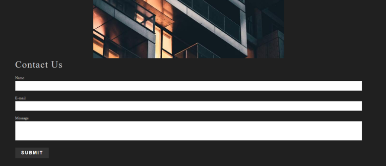
Allow your visitors an easy and secure way to contact you. The contact form is a simple form you can add to your site that emails you submissions when someone uses it to contact you.


Tip: A contact form is a smart option for keeping your contact information secure. Instead of advertising your email address or phone number on your website that potential spammers could use, add a contact form to conceal this information and have your contact form entries go straight to an email address of your choice.


Where to Find


This element can be found in the "Add Content to Page" section of the Toolbar.


Adding to Website


After selecting this element, you will be able to choose exactly where you want to add it! Simply drag the Element onto the purple, orange or blue ribbons on your page.


Setting up your Contact Form


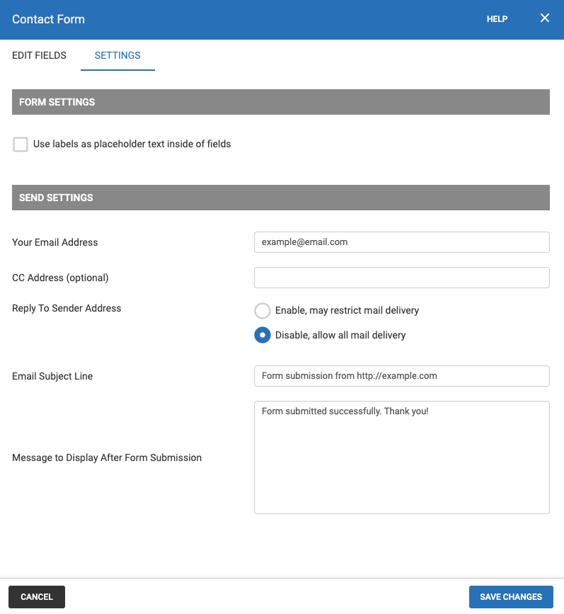
In order to receive entries to your new contact form you will need to configure the Contact Form element to send entries to your your email address. Once you have added the Contact Form Element to your page click the "Form Settings" option in the Element's Toolbar to open the Contact Form Settings tab. From here simply type your email into the "Your Email Address" field in the Send Settings. You can send a copy of the entry to multiple other email addresses by adding them (comma separated) to the "CC Address" field below. 


Set a custom subject line for your Contact Form entries under "Email Subject Line".  You can also fill in the "Message to Display After Form Submission" to customize a message that will appear on your page where the Contact Form is after someone sends a message. 


Check the "Use labels as placeholder text inside of fields" check box to move your Contact form label text 


To confirm the changes you have made in the Contact Form Settings, make sure you click the "Save Changes" button.


We welcome you to send a test message to your own contact form by visiting your website logged out, to see how this Contact Form will look to your visitors. This will also give you an idea of how you will receive these messages in your email inbox.


Reply-To Sender Address


When someone submits an entry on your contact form, you will receive an email with this information. We've recently made an adjustment to our contact forms to enhance their reliability.  In order to do so we have disabled the customer's email address from the reply section to ensure you receive their message. We did this because many popular email providers (such as Gmail or Hotmail) are increasing their spam filter requirements, and having a different address in the reply section can cause it to be incorrectly marked as spam. In order to reply, please send emails to the customer's address that is specified in body of the email. Do not click the reply button as this will simply reply to Bravenet’s email address.

If you wish to enable having the customer’s email address in the Reply section, simply click the “Enable” radio button in the contact form settings. Please be aware this may cause email deliverability issues.


Options


Customize your Contact form by adding your own fields, radio buttons, dates, drop-down menus, and more. To get started, simply go to the "Edit Fields" option in the Element Toolbar to access the Form Design window.


You can drag any of the following items from the left column into the "draggable" areas of the Form fields:


The submit button is required and cannot be removed, however, you can change the text that displays on the button, or choose an image instead.


Text Input: A box for a simple single line of text to be entered. Great for names and e-mail addresses.


Text Area Input: A box for multiple lines of text to be entered. This is better for paragraphs and addresses.


Radio Option: A tool for allowing the form user to choose between selections or options, such as "yes" and "no". A choice can be made and changed, but not removed completely.


Checkbox Option: A simple check box for tasks such as asking the user whether they would like to sign up for your mailing list. Can be selected or deselected.


Dropdown Select: A tool for allowing the user to make a choice between items in a drop-down box. Great when allowing the user to choose their country of residence, for example.


Heading: Add a heading to organize your form.


Paragraph: The paragraph allows you to display a message to the user, the paragraph will appear in the form and in the email received.


Label: A simple line of text. Great for adding a title to break up your form.


Date Field: A field where a date can be typed in or selected from a calendar that appears when the field is clicked on.


Time Field: A field where a date can be typed in or selected from a drop-down menu that appears when the field is clicked on.


File Attachment: A field that a file can be uploaded to when the "Browse" button is clicked.


Note: Clicking the "Required" checkbox will allow you to make the field mandatory!
 

Go Back

Image Gallery Element

An Image Gallery Element is used for adding a number of images to your site, in a variety of ways. Showcase your favorite collection of images by using this element.


Where to Find


This Element can be found in the "ELEMENTS" section of the Toolbar.


Adding to Website


After selecting this element, you will be able to choose exactly where you want to add it! You will see all available content locations it can be added to the current page only (content locations in orange, blue, or purple). 


Adding Images to Your Gallery


The Slideshow Element works by displaying a folder of images on your page. You can access your image settings from the "Images" option in the Element Toolbar. You can configure your slideshow by choosing the folder to display images from via the drop-down. 


If you would like to add more images to your folder, you can click the "Upload Images" button to directly upload images or "Manage Images" to access the Photos and Media Manager for access to your entire file library for your SiteBlocks site.

Note: For help creating folders and organizing images, please see File Folders.


Gallery Settings


Visit the "Settings" option in the Element Toolbar for settings to adjust how your images will appear in the Gallery Element.

Layout: Select the image style for your gallery layout. These predefined layouts will adjust Settings and Border for you. Simply press "Save" to see a layout option.


Settings: Adjust how your images appear in your gallery using the options below.
  • Columns: Adjust how many columns wide your gallery will be (this will automatically adjust the width of your gallery)
  • Pixels Wide: Determines how wide your gallery is
  • Image Spacing: Adjust how much space is between your images displayed in the gallery.
  • Number of Images: Adjust how many images are displayed in your gallery (For example, 5 will display the first 5 images in your gallery)
  • Border: Set a border for your Gallery. Make this visible by increasing the width or invisible by decreasing the width to 0.
  • Options: Select how your gallery loads, the order of images, and if you would like to display an image title using the checkboxes in this section


Go Back

Slideshow Element

An Image Slideshow will allow you to create a slideshow from all of the images in a folder with configurable settings.


Where to Find


This element can be found in the "Add Content to Page" section of the Toolbar.


Adding to Website


Add a slideshow element to your website to display a collection of images.


After selecting this element, you will be able to choose exactly where you want to add it! You will see all available content locations it can be added to - on the current page only (content locations are indicated by the orange, blue or purple ribbons). 


Selecting Images for Your Slideshow


The Slideshow Element works by displaying a folder of images on your page. You can access your image settings from the "Images" option in the Element Toolbar. You can configure your slideshow by choosing the folder to display images from via the drop-down. 


If you would like to add more images to your folder, you can click the "Upload Images" button to directly upload images or "Manage Images" to access the Photos and Media manager for access to your entire file library for your Site Blocks site.

Note: For help creating folders and organizing images, please see File Folders.


Options


You can adjust the slideshow settings including the transition style, image order and speed from "Settings" in the Element Toolbar
  • Slideshow Height:  Adjust the height of your images in your slideshow
  • Max Width: Adjust the height of your images in your slideshow
  • Transition Effects: Allows you to choose what style of transition effect is used between images. We recommend you try a few to decide which style you like!
  • Transition Timing: Choose how long you want each image to appear before transitioning to the next image
  • Animation Speed: Set the speed of the animation for the transition effect
  • Images Shown: Set how many images you would like to display in your slideshow. For example, setting this value to 2 will display the first 2 images in your folder
  • Randomize Images: Keep your images in the order they are in the folder or randomize the order of the images
  • Show Titles: Display the name of your images at the bottom of your slideshow
  • Nav Dots Position: Set the navigation dots below the slideshow or on the top or bottom of the images
  • Show Navigation Arrows< >: Choose if you would like to display the arrows on the images for navigation
  • Show Navigation Dots····: Choose if you would like to display the arrows on the images for navigation


You can access further styling options including styling options for the arrows, navigation dots, adding a border, padding and margins for the Slideshow Element can be found in the "Element Wrapper" toolbar option
  • Controls: Adjust the color of the navigation arrows
  • Indicators: Adjust the height, width, and color settings for the navigation dots
  • Active Indicators: Adjust the colors of the navigation dot of the image that is currently displayed
  • Borders: Add a border around your slide show by selecting the style, width, rounding and coloring. Tip: Increase the Padding to add more space between the slideshow and the border
  • Padding: Increase the padding around the Slideshow Element
  • Margin: Increase the margin around the Slideshow Element


You can add an animation for your Slideshow Element. This will appear when the visitor first loads your page and the animation will display before your Slideshow Appears. To add an animation, simply visit the "Animation" option of the Element toolbar.


You can optionally "Pin" the element to multiple pages to add consistency to the style of your website. Simply select the "Pin" option in your Element's toolbar. 


To quickly add another Slideshow Element on your page, select the "Duplicate" option in the Element's toolbar.


Go Back

Image Element


Insert a single image into your content with this Element.


Where to Find

This Element can be found in the "ELEMENTS" section of the Toolbar under the Content section.


Adding to Website

After selecting this Element, you will be able to choose exactly where you want to add it! Simply drag the Image Element onto the orange, blue or purple ribbons on your page.


Adding an Image

By default, this Image Element will have a stock placeholder photo set as the Image.


To change this, simply double click the placeholder image and select from one of the following methods to select an image:


My Uploaded Images: You can include an image that you have previously uploaded to your Photos and Media manager by selecting the "My Uploaded Images" button. In the Photos and Media Manager, you can browse your file library and folders for the image you would like to add. Select your image and click the "Use Select File" button in the bottom right corner.


Stock Photo Library: SiteBlocks Members enjoy access to over 150,000 free stock photos for use in site. We welcome you to explore and use this library! To upload a stock image to your page, click "Stock Photo Library" to browse and search for an image you would like and click on the image to select it. Once you have selected your image, you will be brought to an image preview page where you can "Use This Image".


Upload new Image: If you already have an image on your computer that you would like to upload to your blog post, click the "Upload new Image" button. Select the folder you wish to upload your file(s) to. If this is left unselected, files will go to the default unsorted categorization. Next, drag and drop or click the upload screen to upload files from your computer. 


Upload Image from Flickr: You can upload images from Flickr, all you need to know is the username of the account you would like to add an image from. To begin, click "Upload Image from Flickr". Type in the username of the Flickr account then "Browse Images". Click the "Select Image" hotlink below the image of your choice.


An External Image URL: If you have the URL of an image you would like to upload, click the "An External Image URL" button to begin. Simply paste in the link of a valid image URL. Please ensure you own the rights to the image in the URL or have permission to link this external Image URL.


Before adding this image to your page, you can adjust how it will appear. Feel free to resize the image using the slider (this shows a to-scale representation of the image) or click the Quick Sizes tab for popular image sizes You can style your image with a border under the Border tab. You can also add ALT text by clicking the ALT tab. The ALT tag of an image assists screen readers, and search engines and provides text if the image does not load. It also appears when you mouse over the image. Lastly, if you change your mind about the image you can upload a different one by using the "My Images", "Upload Image", or "Stock Photos" buttons listed under the Change Image tab.


Options


You can optionally "Pin" the spacer to multiple pages to add consistency to the style of your website. Simply select the "Pin" option in your Element's toolbar

To quickly add another element, select the "Duplicate" option in the Element's toolbar.

To go back to a previous image, select the "Revisions" option to view a list of previous image revisions.

Prefer to work with HTML to customize your image or content? No problem! Simply select the "Edit HTML" option from the Element's Toolbar.

Go Back

20 blog posts