Background and Width
You can set the background for your website to a solid color, pattern, or of an image of your choice. You may also want to set a maximum width for your website or disable this option to leave the width fluid. To control these settings, simply navigate to the '
DESIGN' menu and then visit '
Background and Width'.
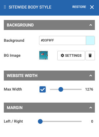
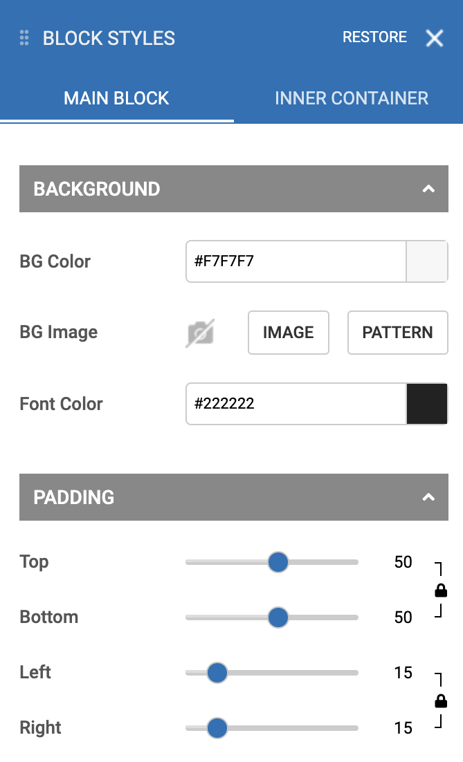
Set a background color by selecting the color picker by clicking on the color square, or by typing in a hex color value of your choice. Optionally, you can set a pattern to display on top of the background color by clicking the '
Pattern' button, or, click '
Image' to choose an image from your uploaded images or stock photo library to display as the background.
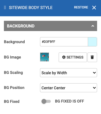
If you have chosen an image background, you can click the '
Settings' button to access a variety of image setting options. You can choose a different scaling setting, or enable the fixed background setting to create a parallax effect.
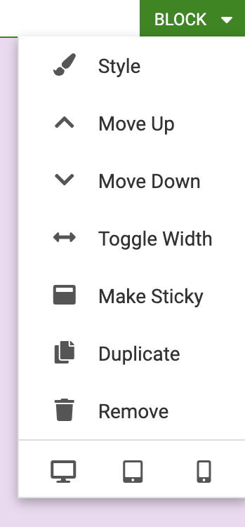
Tip: Don't see the background color or image appear after saving? Any blocks that have their own background will cover the main website background. You can remove the block's background by going to the 'Style' menu and setting the color to transparent from the block's toolbar, then your website's background should be displayed behind that block.
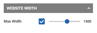
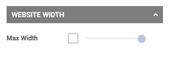
To change your website's maximum width, navigate to the website width section of the style menu and click the checkbox to enable the maximum width, then use the slider to set a maximum width in pixels. Alternatively, you may leave this option unchecked to have no maximum width, allowing a more fluid effect (this is useful for users with widescreen sizes).
|
|
 |
|
Set a Maximum Width
|
Fluid Width (No Maximum Width) |
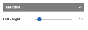
If you wish to have a margin on the left and right-hand sides of your pages, you can achieve this look by navigating to the website margin section of this style menu and using the slider to set a margin in pixel units.
Base Font Style
You can set a default font for your website by navigating to '
DESIGN' and then '
Base Font Style'. This can be useful if you have the desired font style, size, or color in mind that you wish to have the majority of your content on your website appear in. While all fonts are fully customizable in each block, your base font is the default font that will initially be set for your blog post or paragraph content (and other locations across your website).
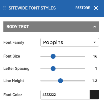
Choose a font family and adjust the font to your liking by adjusting the size, letter spacing, line height, and font color.
Heading /Title Styles
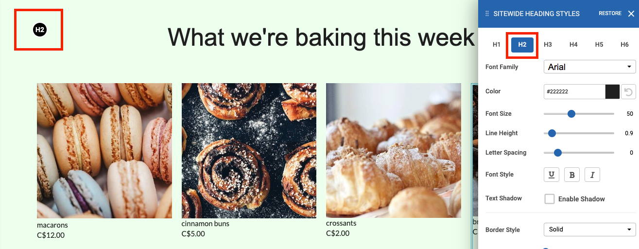
There are 6 title styles you can set for your website. When setting a title in the title element or the Paragraph element, you can choose from Heading 1, Heading 2, ..., Heading 6. In order to change the font style, sizing, spacing, or color, for a particular header, you can do so by navigating to the '
DESIGN' menu, and then select '
Heading / Title Styles'. From here, you can select the header you would like to edit by selecting the correct tab in the style menu (tabs H1 to H6).
 Tip
Tip: Not sure which heading style your title is in that you are looking to change? Navigate to the page your title is on first, then open the Heading / Title Styles menu. Once the menu is open, there will be a bubble indicating which header is in use (H1 through H6).
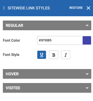
Link Styles
Choose your default link style by navigating to the '
DESIGN' menu and then '
Link Styles'. From here, you can set a font style, size, and color. The font styling under the '
REGULAR' section will be the default style for any unvisited links. Optionally you can also change the style under the '
HOVER' section to change the appearance of the link styling when a visitor hovers their mouse over the link. Lastly, you can change the appearance of visited links from the '
VISITED' section.
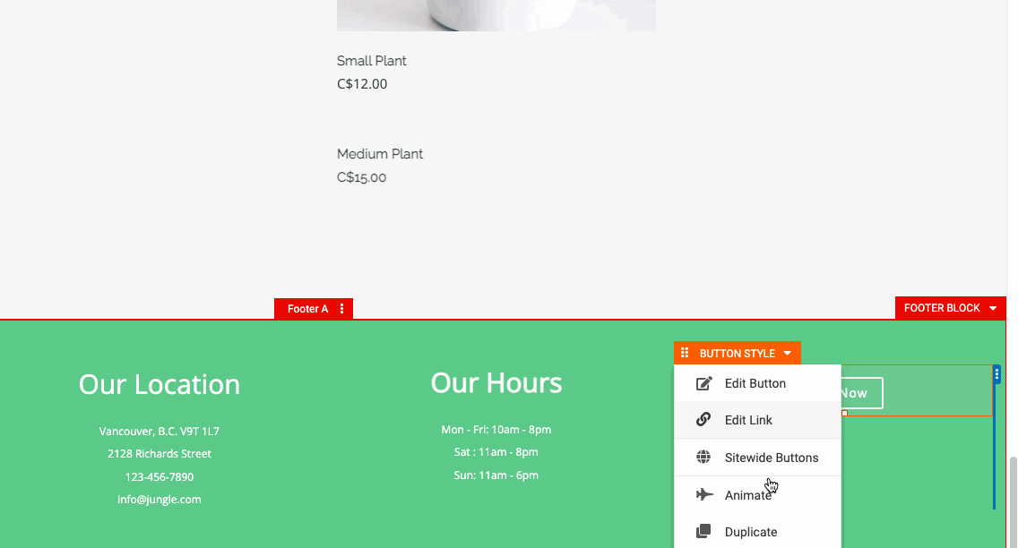
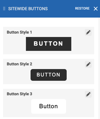
Button Styles
When creating a button for your website, you are given many different button styles that are provided with your template to choose from. All of these button styles are fully customizable. To customize a button style, go to the '
DESIGN' menu and then '
Button Styles'. There are many customization options for the button, adjust everything from the font, shape, size, and color of the button. You can even set a hover style so your button changes styles when your visitor hovers their mouse over the button by adjusting the 'Hover Style' options from this menu. Lastly, remember to save your changes to apply them.
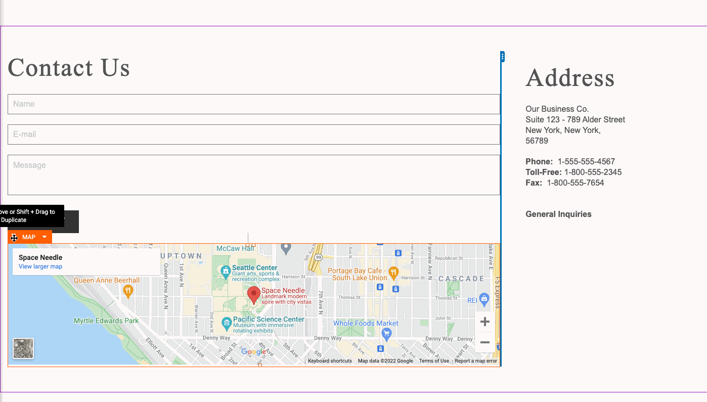
Form Styles
There are various locations throughout your website where you may have input forms, including Contact Form elements, blog comments, visitor comments, and search bars. You can completely style all components to a form including the input fields, labels, titles, and the validation text that appears after submitting input. In order to style your form, go to the '
Design' menu and then '
Form Styles'.
Visit the corresponding tabs in the Form Styles menu to style the following:
- Input Fields
- Input Labels
- Validation Text
- Submit Button
- Checkbox/Radios
- Title Text
- Paragraph Text
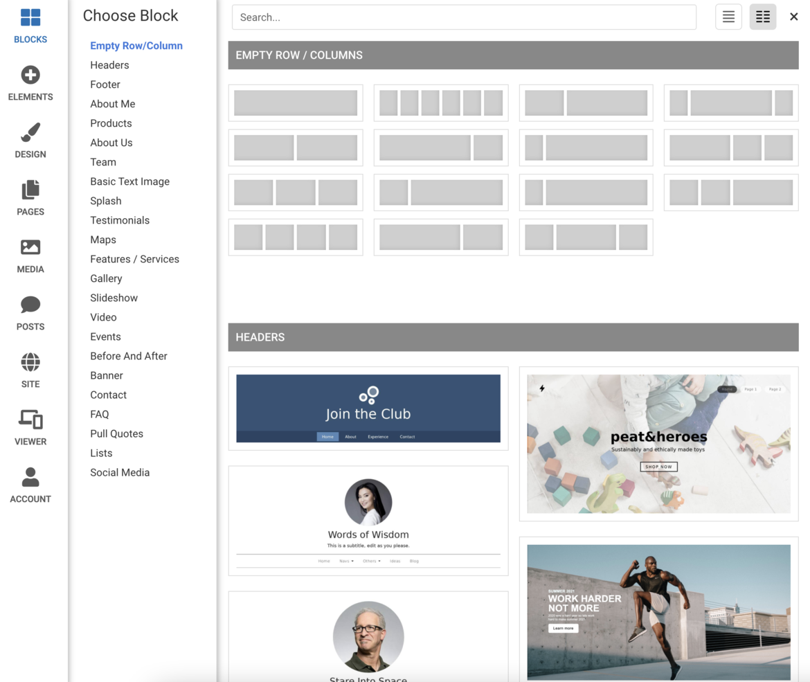
Tip: Want to quickly add a Contact Form with a unique style? Visit the Contact Forms section of the '
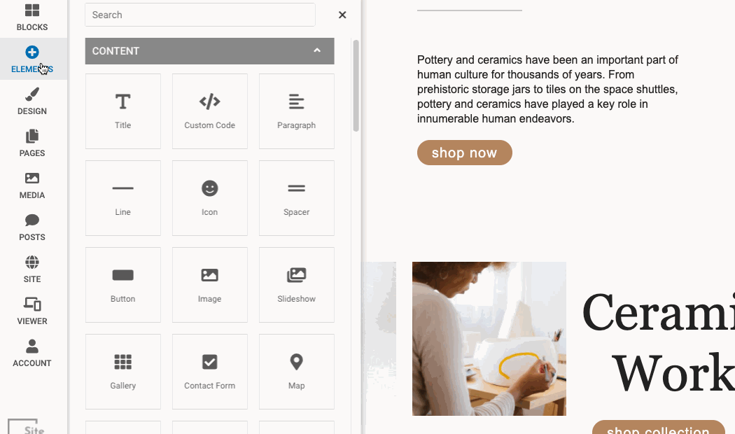
BLOCKS' menu to add a pre-designed contact form to your page.